Painting Your Home: How to Choose a Color Palette That Matches Your Lifestyle

Painting your home is one of the easiest ways to create a space that feels both beautiful and personal. The right colors can reflect your style, shape the mood of each room, and bring harmony to your entire home. Knowing how to choose a color palette that matches your lifestyle helps you make decisions with confidence and enjoy your space more.
In this article, we will guide you through the process of finding a color palette that fits your personal style and home design. We will talk about how mood, lighting, and room function influence color choices. You will also learn about the role of neutral tones, accent colors, and paint finishes. Finally, we will explore how to create a seamless flow between rooms and determine whether bold or subtle tones are best suited for you.
Whether you love modern design, cozy traditional spaces, or something in between, your color choices matter. The colors you see every day affect how you feel, how you relax, and how you connect with your home. That is why choosing a palette that reflects your lifestyle is worth the effort.
Your personal style is the foundation for your home's color palette. If you prefer modern design, clean whites, grays, and blacks may feel natural. If you like rustic interiors, warm browns and muted greens can be a more suitable match.
Think about your clothing style as well. People often choose home colors that are similar to the shades they wear most frequently. If your closet is filled with earth tones, you may be drawn to beige, cream, or olive. If you love bold prints, deeper blues or reds may feel right in your home.
How Do Interior Design Themes Shape Your Color Palette?
Interior design themes give direction to your interior paint color choices. A coastal theme calls for airy blues, sandy neutrals, and soft grays. A farmhouse style works well with creamy whites and warm woods. Traditional interiors can feature navy, burgundy, and cream for a rich look.
Choosing a theme helps narrow down your options. This makes it easier to avoid colors that may look great on a paint chip but do not match the rest of your home.
What Is Color Psychology In Home Painting?
Every color creates a feeling. Warm colors, such as yellow or orange, produce an energetic atmosphere, while cool colors, like blue or green, evoke a sense of calm. Pink can feel soft and comforting, while deep gray feels sophisticated.
Ask yourself how you want each room to feel. Do you want the living room to feel cozy and social, or modern and sleek? Do you want the bedroom to feel restful or bold? The mood you prefer should guide your color palette.
Color psychology studies how colors influence behavior and emotions. Blue brings calm, green feels refreshing, yellow creates happiness, and red feels powerful. Gray adds balance, while white feels open and clean.
Utilizing color psychology can help you select paint colors that complement your lifestyle. For example, a home office benefits from blues or greens that promote focus and concentration. A dining room can feel inviting with warm tones that spark conversation.
Warm colors include red, yellow, and orange. They feel lively and cozy. Cool colors include blues, greens, and purples. They feel calm and refreshed.
Warm colors are great for living rooms or kitchens where you want to create an energetic atmosphere. Cool colors are ideal for bedrooms or bathrooms where you want to develop a sense of peace. Mixing warm and cool tones can create a balanced look in your home.
Why Are Complementary And Accent Colors Important?
A complete color palette needs both base and accent shades. Complementary colors, which are opposite each other on the color wheel, create balance and contrast. Accent colors help highlight areas of your home, such as a bold shade on a feature wall or trim.
Using accent colors wisely allows you to bring energy into a space without overwhelming it. For example, navy cabinets in a kitchen can stand out beautifully against white walls.
How Do Neutral Tones Work In A Home Color Palette?
Neutral tones, such as white, beige, taupe, and gray, are timeless. They give you a flexible backdrop for furniture and décor. Neutrals also make rooms feel larger and calmer.
If you are worried about neutrals feeling flat, you can use texture. Pair a soft gray wall with wood floors or woven fabrics for a cohesive look. Layering shades of the same neutral also creates depth.
How Can Color Harmony Create Flow Between Rooms?
Color harmony is what ties your entire home together. Without it, each room can feel disconnected, like separate pieces instead of part of a whole. Harmony does not mean every room should be painted the same shade, but it does mean colors should complement each other and create a natural rhythm as you move through the house. When your palette flows, your home feels intentional, not accidental.
One way to achieve harmony is by choosing a main neutral that runs through most of the house, then layering in accent colors in specific spaces. A soft beige or gray might be the base in your living areas, while the kitchen gets a sage green accent and the dining room adds a rich navy tone. These touches give each space its own character while still feeling connected to the larger palette.
Another approach is to select colors from the same family. For example, different shades of blue—from pale sky in the bathroom to deep indigo in the bedroom—create variety without clashing. This subtle shift adds depth while keeping the flow consistent.
Harmony also helps guide the eye. When colors repeat in trim, doors, or accent pieces, your brain recognizes the connection. The result is a home that feels welcoming and well thought out, no matter how many different shades you use.
How Does Lighting Impact Home Paint Colors?

Lighting has one of the biggest effects on how paint looks, often more than the paint itself. A color that seems perfect in the store can look completely different once it is on your walls at home. Natural light, in particular, changes throughout the day, which can make a shade look bright and cheerful in the morning but muted and dull in the evening.
The direction your windows face also plays a role. North-facing rooms tend to make colors appear cooler, giving grays and blues a sharper tone. South-facing rooms get warmer light, which can soften colors and make them feel richer. East-facing rooms glow with morning light but cool off in the afternoon, while west-facing rooms shift the other way, starting cooler and warming as the day ends.
Artificial lighting adds another layer. Warm bulbs make yellows, oranges, and reds glow but can muddy cooler shades like blue or green. Cool white bulbs enhance crisp, modern tones but may wash out warmer hues. The type of fixture also matters—recessed lights spread color evenly, while table lamps create softer, localized effects.
Because of all these factors, it is critical to test paint before you commit. Large swatches painted directly on your wall will show you how the color behaves in morning light, afternoon sun, and evening lamp light. What you see at one time of day may not be what you get all the time, so this step helps prevent surprises.
How Should The Room Function Influence Your Color Palette?
The way you use a room should always influence its paint color. Bedrooms are a place for rest, so soft tones like pale blue, gentle green, or muted lavender create a sense of calm. These colors help lower energy levels at the end of the day and set the stage for better sleep.
Living rooms, on the other hand, are often gathering spaces where energy and connection matter. Warm tones like soft beige, creamy ivory, or even rich terracotta can encourage conversation and make the space feel inviting. Adding subtle accent colors through trim or an accent wall can also give the room personality without overwhelming it.
Kitchens and dining areas benefit from brighter or fresher tones. Clean whites, sunny yellows, and light greens create energy and help these high-use areas feel lively. These colors can even stimulate appetite and make mealtimes feel more enjoyable. If you prefer something modern, a crisp gray or muted navy can bring elegance while still keeping the space functional.
Bathrooms, offices, and entryways each have their own needs as well. Bathrooms often look best in light, refreshing colors that feel clean and crisp. Offices thrive with muted tones that support focus, such as green or gray-blue. Entryways are transitional, so they work well with neutrals or darker tones that make a first impression. Thinking about the role each room plays ensures your palette does more than look nice—it supports the way you live.
Why Is Sample Testing Necessary In Home Painting?
Sample testing is one of the most important steps in painting your home, yet it is often skipped. Looking at a tiny paint chip in the store does not give you an accurate idea of how the color will appear on your walls. Even painted sample cards can be misleading because they are not influenced by the light, textures, and furnishings in your home.
Painting a larger sample directly on the wall helps you see how the color interacts with your specific space. A soft beige that looks warm in the store may feel gray in your living room depending on the light. Likewise, a deep blue might look rich on a small card but feel overwhelming once applied to a full wall. Seeing the shade in context prevents costly mistakes.
It is also important to live with the sample for a few days. Colors can shift throughout the day as light changes. What feels cozy in the evening may look too dark in the morning. By checking the sample at different times, you will know whether the color truly works for your lifestyle.
Finally, samples give you confidence. Painting is a big commitment, and once the walls are done, changing them again is not always easy. Testing ahead of time allows you to move forward knowing the shade is the right choice. It removes guesswork and ensures you are happy with the final result.
How Does Furniture And Décor Affect Your Paint Colors?
Your existing furniture and décor should always guide your paint choices. Walls are the backdrop of a room, and they need to work in harmony with what is already there. A bold sofa in red or teal, for example, will stand out beautifully against soft neutral walls. On the other hand, a room filled with beige or cream furniture may benefit from a darker wall color to add depth and contrast.
Flooring plays a big role as well. Warm wood tones pair nicely with cooler shades like blue, gray, or green because the contrast creates balance. Light tile floors may need richer wall colors to prevent the room from feeling too stark, while darker floors often look best with lighter walls that keep the space open.
Decorative pieces such as artwork, rugs, and curtains are excellent sources of inspiration for a palette. If a large rug has hints of navy and gold, pulling those colors into the walls or trim can create a unified look. When you use existing décor as a starting point, your design feels intentional and avoids the mismatched feeling that comes from choosing paint in isolation.
Even smaller details, like throw pillows, lamps, or shelving, can guide your color choices. Coordinating your walls with these accents ties everything together and makes the room feel finished. The result is a space where every element works together instead of competing for attention.
What Are Some Wall Color Ideas For Your Home?
Wall colors can completely change the mood of a room, and the right choice depends on both your style and the function of the space. Soft sage green is a popular option for kitchens and bathrooms because it feels clean, calming, and natural. In bedrooms, creamy beige or warm taupe can add comfort and create a cozy atmosphere for relaxation.
For living rooms or dining rooms, charcoal gray adds a sense of modern drama and sophistication. This deep tone works especially well in spaces with plenty of natural light or paired with crisp white trim. Warm terracotta has also grown in popularity because it adds energy and life without being too overpowering. It works well on accent walls, in entryways, or even in sunrooms.
Classic white continues to be one of the most versatile choices. It provides a fresh, timeless look that suits almost any style, from farmhouse to modern minimalism. White walls also allow your furniture, art, and decorative pieces to take center stage. If you want flexibility to change your décor often, white or off-white is a safe and stylish option.
You can also mix colors creatively across your home. A soft neutral base in hallways and shared areas keeps the flow consistent, while bolder choices in bedrooms or offices allow for personal expression. The best wall colors are the ones that feel right for your lifestyle and create the mood you want in each space.
Should You Follow Paint Trends Or Choose Timeless Colors?
Paint trends can be inspiring, but they also change quickly. A shade that feels fresh this year may feel dated in just a few years. That is why timeless colors, such as neutrals, are often the better choice for large areas like walls. They provide a stable foundation and allow you to refresh the space with smaller changes over time.
Timeless shades include soft whites, grays, beiges, and muted earth tones. These colors never go out of style and are easy to pair with any type of furniture or décor. They also create flexibility if you want to change accessories like pillows, rugs, or curtains without repainting.
Trendy colors still have a place in home design. Bold greens, deep blues, or even rich terracotta can add excitement when used as accent walls, in smaller rooms, or through trim. By keeping these shades limited to areas that are easy to repaint, you can stay current without locking yourself into a trend that may fade.
The best strategy is to combine timeless and trendy. Use neutrals as your base, then layer in fashionable shades in smaller doses. This approach gives your home personality while also ensuring it stays stylish for years to come.
How Do Paint Finishes Affect Your Color Choice?
Paint finishes are just as important as the color itself. They affect how the shade looks, how much light it reflects, and how durable the surface will be. A matte finish, for example, gives walls a smooth, soft appearance but is not as resistant to stains or scrubbing. It works best in low-traffic areas like bedrooms or ceilings where durability is not as critical.
Eggshell and satin finishes strike a balance between beauty and function. They have a subtle sheen that reflects a little light without being too shiny. These finishes are great for living rooms, dining rooms, and hallways where you want a polished look with easy cleaning.
Semi-gloss and gloss finishes are the most durable and are often used on trim, doors, and cabinets. They reflect more light, which makes colors appear brighter and more vivid. Because they resist moisture and stains, they are also perfect for kitchens and bathrooms where surfaces are exposed to splashes and frequent cleaning.
Choosing the right finish ensures that your color looks its best and stands up to everyday life. The same shade of paint can look completely different depending on the finish, so this detail should always be part of your decision-making process.
Why Consider a Custom Home Color Palette?
A custom color palette designed by professionals gives you confidence. It ensures that your colors match your furniture, flow through each room, and highlight your lifestyle.
Working with experts takes away the stress of trial and error. It also helps you avoid costly repainting in the future.
Are you ready to choose a color palette that matches your lifestyle?
Painting your home is more than a design choice. It is about creating a space that feels right for you and supports the way you live. From personal style to lighting, from psychology to functionality, each factor plays a crucial role.
If you are ready to create a palette that reflects your lifestyle, our team is here to help. Contact Browder Painting Company today to get expert advice and a detailed quote for your next home painting project.
Our Recent Articles
-
Deck Staining vs. Painting: Which Lasts Longer?
Deck projects usually start the same way: the wood starts looking worn, faded, or tired, and suddenly you’re down a rabbit hole trying to figure out whether you should stain it, paint it, and what kind of products are best for your deck. And depending on where […]
-
How Cabinet Painting Can Transform Your Kitchen Without a Full Remodel
Your kitchen sets the tone for daily life. If the layout works but the cabinets feel tired, cabinet painting in Avila Beach, CA can deliver a dramatic change without demolition. With the right prep, products, and process, a pro team can refresh doors, drawers, and boxes […]
-
Should You Paint Your House and Clean Your Windows at the Same Time?
We all know the sayings: two birds with one stone, more bang for your buck… but what about two home improvements with one project? We get asked all the time: “Should my windows get cleaned before, after, or even during painting?” And the short answer is: after. […]
Our Latest Projects

Project Overview This HOA townhome complex in Atascadero was ready for an update. Originally painted all one color, the community felt flat and lacked definition. The goal was to introduce a coordinated multi-color scheme to give each building more character while still keeping a cohesive overall look. Getting […]
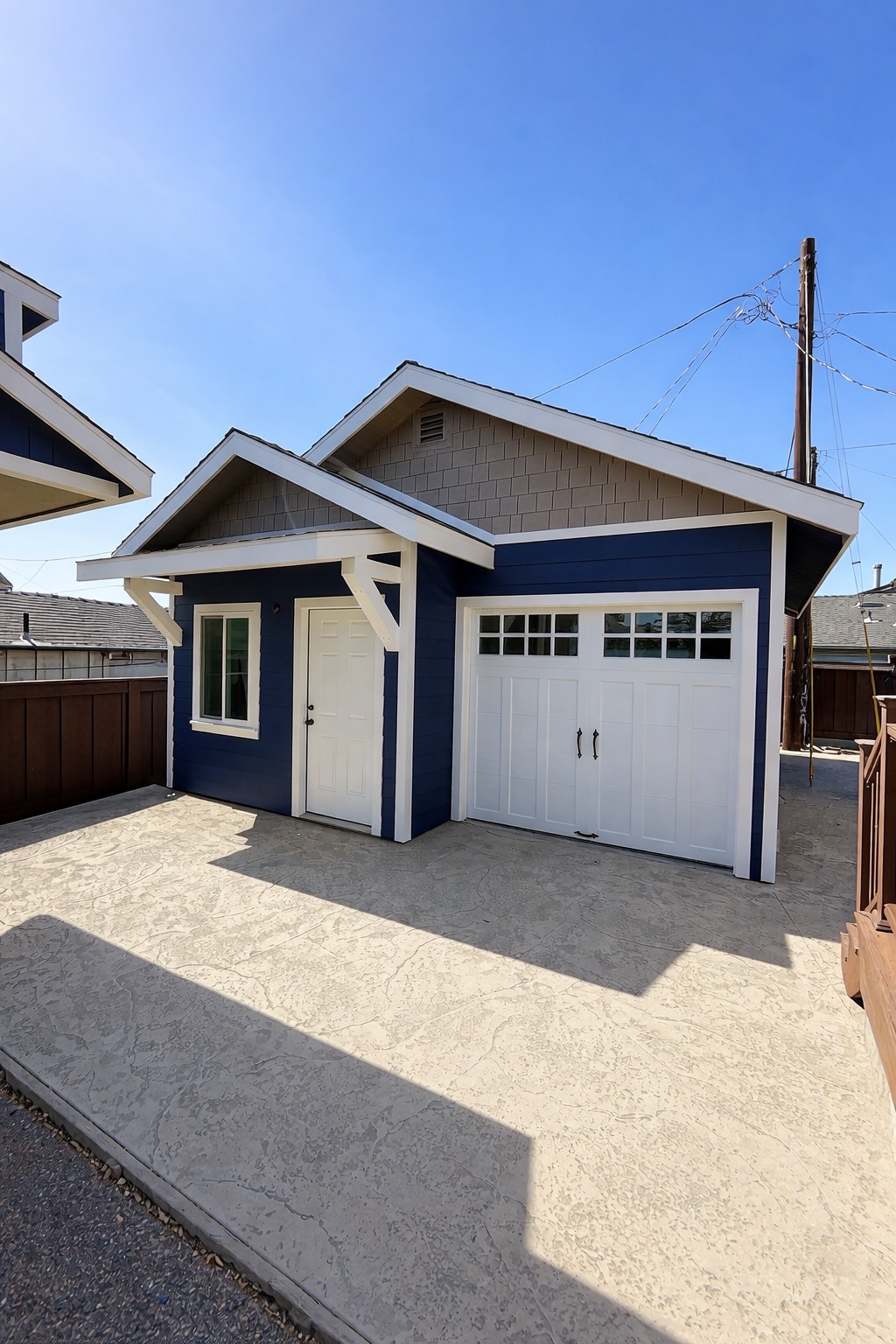
Exterior Painting Project Overview This project focused on completing the exterior finish of a newly constructed detached garage, designed to complement the main home while adding long-term durability and visual appeal. The goal was to create a bold yet timeless look that enhances the property’s overall design. Getting […]
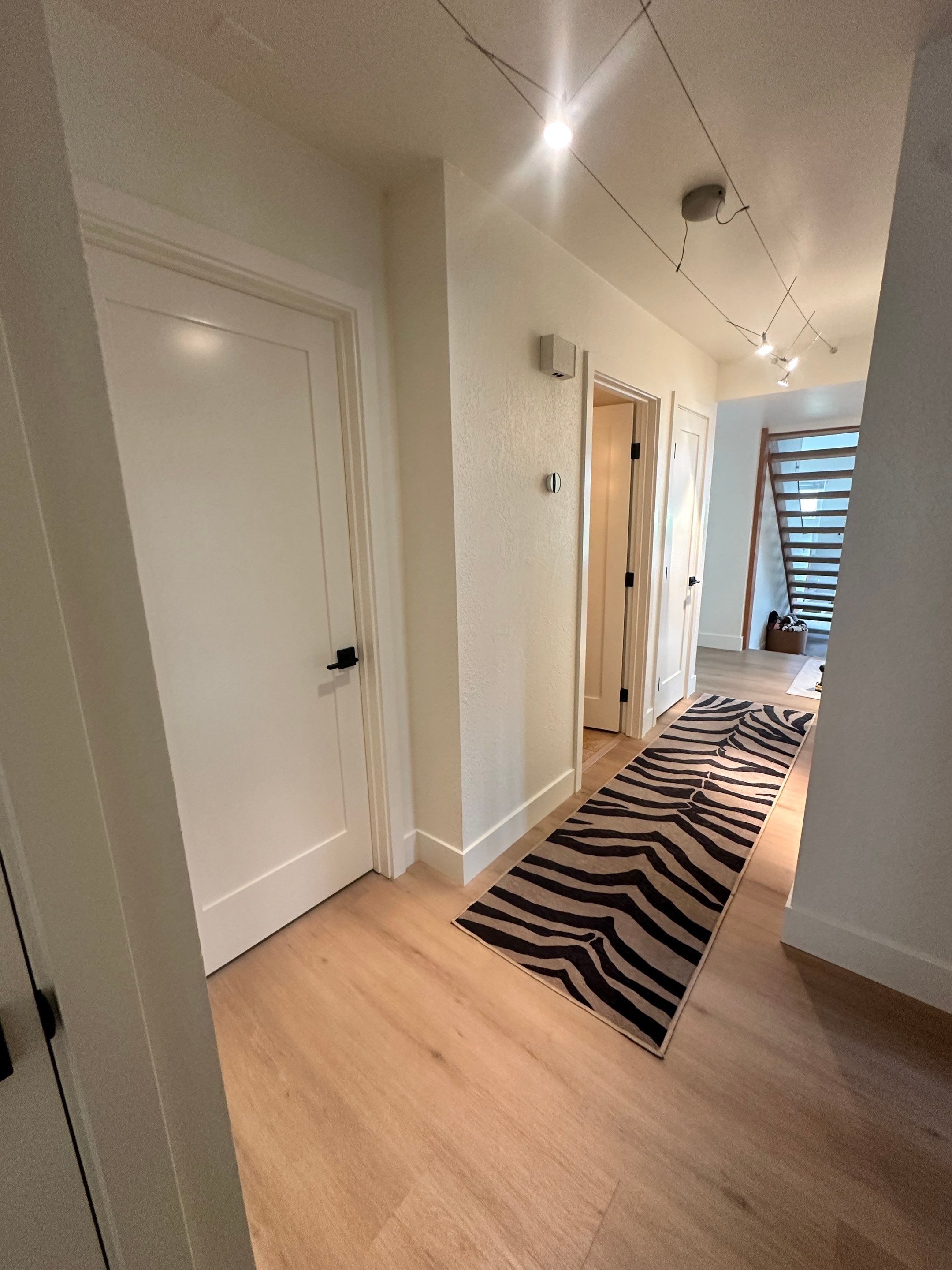
Sometimes a home doesn’t need a full repaint—just the right details refreshed to make everything feel clean and finished again. For this San Luis Obispo project, the focus was on updating several interior doors, trim, and entry details, along with a few small touch-ups. Our team carefully […]