What Are the Best Interior Paint Colors To Make Your Home Feel Bigger?

The best interior paint colors to make your home feel bigger are light neutrals, soft whites, pale grays, and calm, cool tones. These shades reflect more light, helping the eye move smoothly across the room without stopping. They create an easy, open feel that makes small spaces seem wide and tall. In this guide, you will learn how color, finish, and placement work together to stretch a room.
We will examine how light reflectance contributes to making rooms feel bright. We will cover soft whites, pale grays, light beiges, off-whites, soft blues, and pale greens. We will also explain the value of a monochromatic palette and why low contrast adds flow. You will receive room-by-room tips and straightforward testing steps you can apply today.
You will also learn about the light reflectance value, also known as LRV. LRV tells you how much light a color bounces around. A higher LRV means a brighter feel. Picking paints with a higher LRV is an easy way to get a more open look. You will see how ceilings, trim, and even floors play a role.
By the end, you will know how to choose the best interior paint colors to make your home feel larger and how to place them to maximize the space. You will have a plan you can follow, even if you are working with a single small room or a complete home refresh.
Why Do Light Neutrals and Soft White Paint Colors Make Rooms Look Bigger?
Light neutrals and soft whites reflect light like mirrors. They bounce both daylight and lamp light back into the room. That extra bounce reduces shadows. Fewer shadows mean the edges of the room feel farther away. Your eye reads that as more space.
Soft white usually looks better than stark white in lived-in rooms. A touch of warmth or a hint of gray keeps the color gentle. A harsh, bright white can feel cold and reveal every flaw on a wall. Soft white is kinder. It is easy to live with and still gives you a clean, airy look.
When selecting a neutral, pay attention to its undertone. A whisper of cream adds warmth. A drop of gray keeps it calm. The right undertone should complement the lighting in your room and the existing finishes. If your floors are warm, a warm, off-white will look natural. If your counters are cool, a cooler white may be a better fit.
Soft white paint colors work best for small rooms. Look for names that hint at cream, linen, or cloud. Think about well-known options like White Dove or Simply White from Benjamin Moore, Alabaster or Snowbound from Sherwin-Williams, or School House White from Farrow and Ball. Each of these reads soft, not stark. Always sample first, as light and surfaces can alter how a color appears on your walls.
Can Pale Gray Paint Colors and Cool Tones Make a Home Feel Bigger?

Yes. Pale gray and cool tones help walls recede. Cool colors sit back in space. They add depth without weight. A light gray with a hint of green or blue can evoke a sense of modernity and calmness simultaneously. It keeps the room open and adds just enough mood to feel cozy at night.
Grays that work well in small rooms are not dark or heavy. Aim for a pale, soft gray that stays bright in low light. For a friendly, flexible gray, try shades like Classic Gray from Benjamin Moore, Agreeable Gray, or Repose Gray from Sherwin-Williams. These are gentle, so they play well with wood, stone, metal, and fabric.
Soft blue and pale green paint colors may expand your space because they are classic space makers. Think of the sky and sea, and how those views feel expansive. These colors relax your eyes and guide them across the room. Try misty blues and silvery greens, such as Sea Salt or a light powder blue. These coastal colors are calm, fresh, and easy to pair with white trim, pale wood, or woven textures.
Do Light Beige and Off White Paint Colors Keep Rooms Bright and Open?
Light beige and warm off-whites soften a space while keeping it bright and inviting. They are perfect for north-facing rooms that can feel cool. A gentle beige wraps the space in a glow. It still reflects light and keeps the room feeling open. If your home has warm floors, warm counters, or brass finishes, a light beige on the walls ties it all together.
The key is to choose a beige that is neither too yellow nor too pink. You want a quiet warmth that feels like sunlight on a wall, not a heavy tan. Test a few options and watch them from morning to night.
Will Subtle Pastel Paint Colors Add Color Without Making Rooms Look Smaller?
Yes. Subtle pastels can add a hint of color without overwhelming the room. Think soft peach, dusty lavender, or a light mint. Keep the saturation low to maintain an airy feel. Pair a pastel with a smooth white ceiling and trim in the same family. That keeps the flow and prevents sharp breaks that can chop up the space.
Too much contrast is the most common mistake that makes a room look smaller. Here are few more missteps to watch out for:
- Sharp changes in value chop up the space
- Dark trim on light walls or a dark feature wall in a small room can make it feel shorter and narrower.
- Using a stark, cool white in a shadowy room can also be tough. It can look gray and dingy instead of bright.
- Picking the wrong undertone can clash with floors or counters, making the room feel stressed.
- Using many colors in one view can add clutter and make the home feel busy.
- Not testing colors is another trap. Paint always looks different on your walls than it does on a tiny chip.
Will a Monochromatic Paint Color Palette Make Small Rooms Look Bigger?

A monochromatic palette utilizes a single color in various shades. This reduces visual breaks. When your walls, trim, doors, and even built-ins share a family of hues, your eye does not stop at every edge. The room feels like one continuous space. That sense of flow adds square footage to the way the room feels, even if the tape measure does not change.
You can still achieve interest by varying the levels of lightness and by incorporating texture. A wall in a pale gray, a ceiling in a softer version, a trim in a whisper-darker shade, and fabrics with a nubby texture will feel rich and calm at the same time.
What Is High Reflective Paint and What LRC Makes Rooms Look Bigger?
High reflective paint is paint that bounces a lot of light. This is measured by LRV, or light reflectance value. The scale runs from zero to one hundred. Higher numbers reflect more light. For small rooms, colors with an LRV around 60 to 85 often feel bright and open. A soft white might sit at the high end. A light gray or pale beige might land in the middle.
Finish matters too. On walls, eggshell or satin finishes offer a gentle sheen that reflects light while concealing minor imperfections. For trim and doors, satin or semi-gloss finishes help frames and edges appear crisp. On ceilings, a flat or matte finish reduces glare and hides seams while still feeling bright, especially if the color is light. If you paint floors, a higher gloss finish will reflect more light and can boost the open feel, but it will show wear faster, so weigh that trade-off.
How Can I Use Paint Colors To Enhance Natural Light and Make Rooms Look Bigger?
Start by reading your light. North-facing rooms are cool and even. South-facing rooms are warm and bright. East light is bright in the morning and soft in the afternoon. The west light glows late in the day and can appear orange near sunset. Choose undertones that complement the tone of your skin. Warm off-whites can brighten a cool north room. Cool tints can calm a hot southern room.
Choose colors with a higher LRV to amplify the light you have. Use finishes that suit each surface. Keep window trim close and straightforward in value to the walls, so the view stays the star. If you are open to it, a light, glossy floor can reflect daylight up into the space, making it appear brighter. Keep window coverings light and simple so they don't absorb too much light.
How Should I Test Paint Colors to Ensure My Room Looks Bigger?
Test large samples right on the wall or on foam boards. Apply at least two coats to ensure the color appears true. Move the boards around the room and watch the color from morning to night. Turn on the lamps at night and make sure it still feels open. Place the sample next to floors, counters, and fabrics. The right color should blend without clashing. Keep your test group small. Two or three options will help you see differences clearly. Pick the one that stays bright in shade and sunny in light. That is the color that gives you a bigger feel all day.
Ready To Choose the Best Interior Paint Colors To Make Your Home Feel Bigger?
You now know how light neutrals, soft whites, pale grays, and cool tones can enhance the look of your rooms. You know why low contrast adds flow, how LRV guides brightness, and how ceilings, trim, and even floors can boost the sense of space.
If you are ready to refresh your home, get more information, request a quote, or contact us today to book your appointment now.
Our Recent Articles
-
Why Proper Surface Preparation Is the Key to a Long-Lasting Paint Job
Great color is only half the story. The secret to a smooth, durable finish is paint surface preparation that fits our coastal conditions in Cayucos, CA. When you choose Browder Painting Company, you get a local team that does the quiet work behind the scenes so […]
-
Deck Staining vs. Painting: Which Lasts Longer?
Deck projects usually start the same way: the wood starts looking worn, faded, or tired, and suddenly you’re down a rabbit hole trying to figure out whether you should stain it, paint it, and what kind of products are best for your deck. And depending on where […]
-
How Cabinet Painting Can Transform Your Kitchen Without a Full Remodel
Your kitchen sets the tone for daily life. If the layout works but the cabinets feel tired, cabinet painting in Avila Beach, CA can deliver a dramatic change without demolition. With the right prep, products, and process, a pro team can refresh doors, drawers, and boxes […]
Our Latest Projects
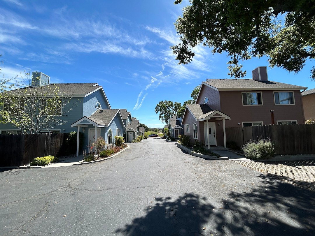
Project Overview This HOA townhome complex in Atascadero was ready for an update. Originally painted all one color, the community felt flat and lacked definition. The goal was to introduce a coordinated multi-color scheme to give each building more character while still keeping a cohesive overall look. Getting […]
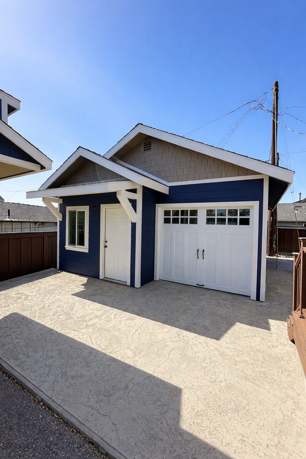
Exterior Painting Project Overview This project focused on completing the exterior finish of a newly constructed detached garage, designed to complement the main home while adding long-term durability and visual appeal. The goal was to create a bold yet timeless look that enhances the property’s overall design. Getting […]
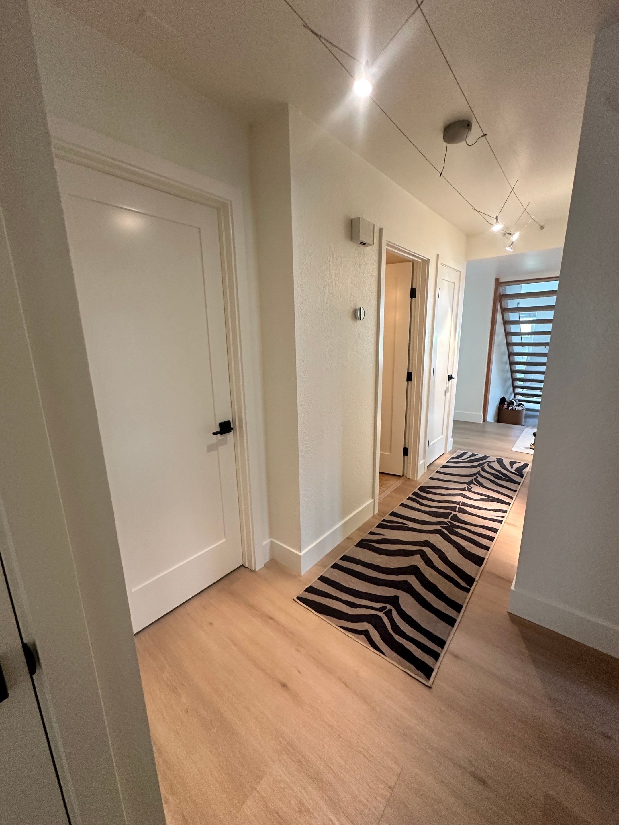
Sometimes a home doesn’t need a full repaint—just the right details refreshed to make everything feel clean and finished again. For this San Luis Obispo project, the focus was on updating several interior doors, trim, and entry details, along with a few small touch-ups. Our team carefully […]